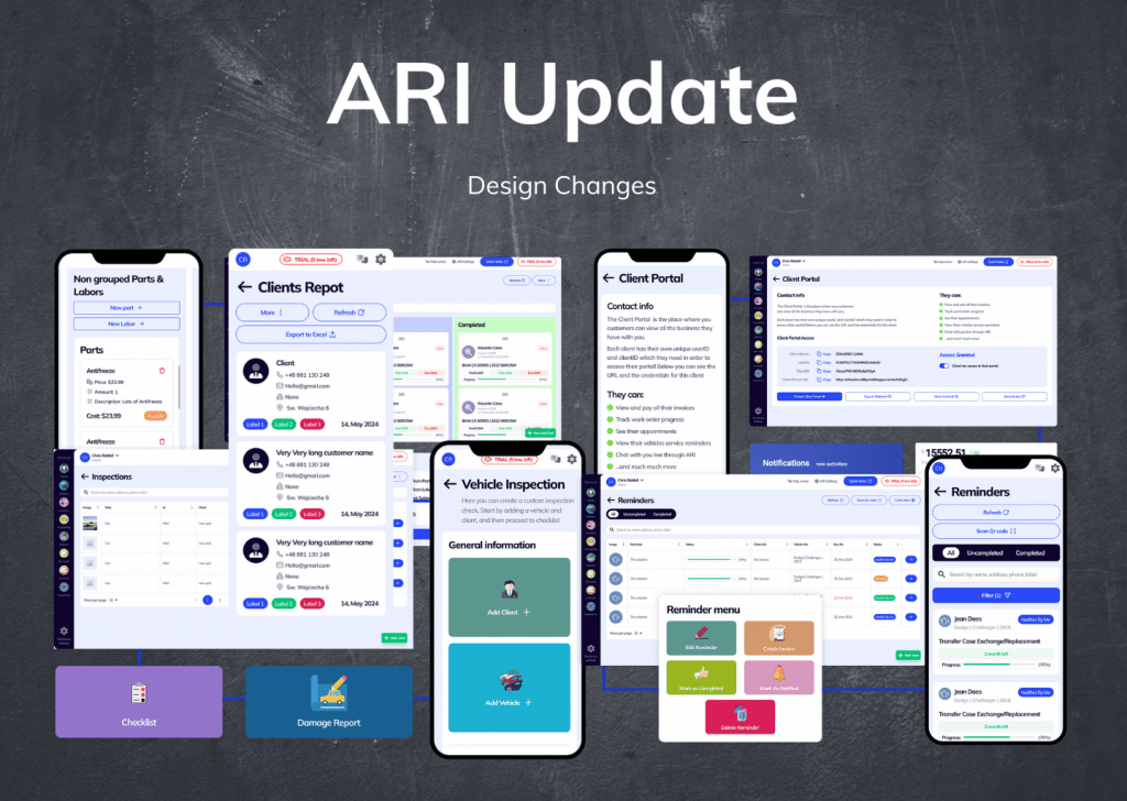
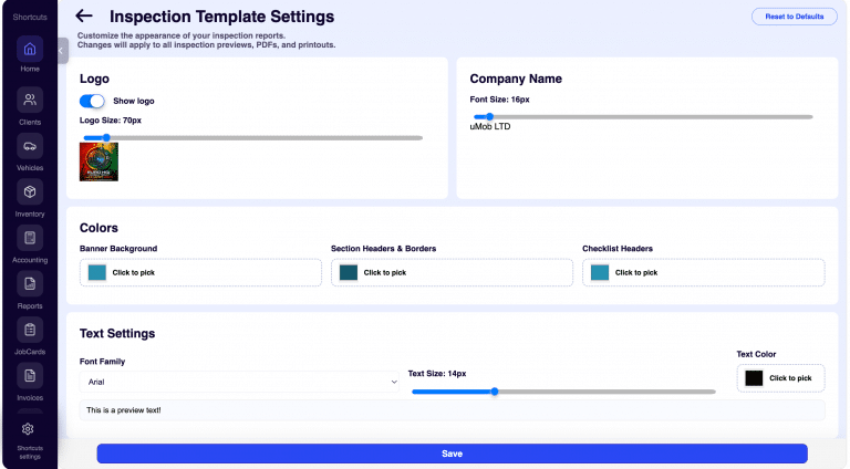
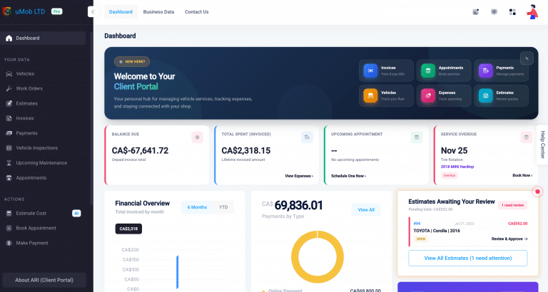
Here at ARI (Auto Repair Software), we’ve been busy behind the scenes, not just patching up the usual “bugs” but giving our entire auto repair software a serious makeover. Think of it like taking a reliable vehicle, refreshing its engine, and then giving it a sleek new paint job and a comfortable interior. The latest software update features a complete redesign of our User Interface (UI) and a massive boost to your User Experience (UX). And trust us, this isn’t just cosmetic – it’s about making your daily work a whole lot smoother.
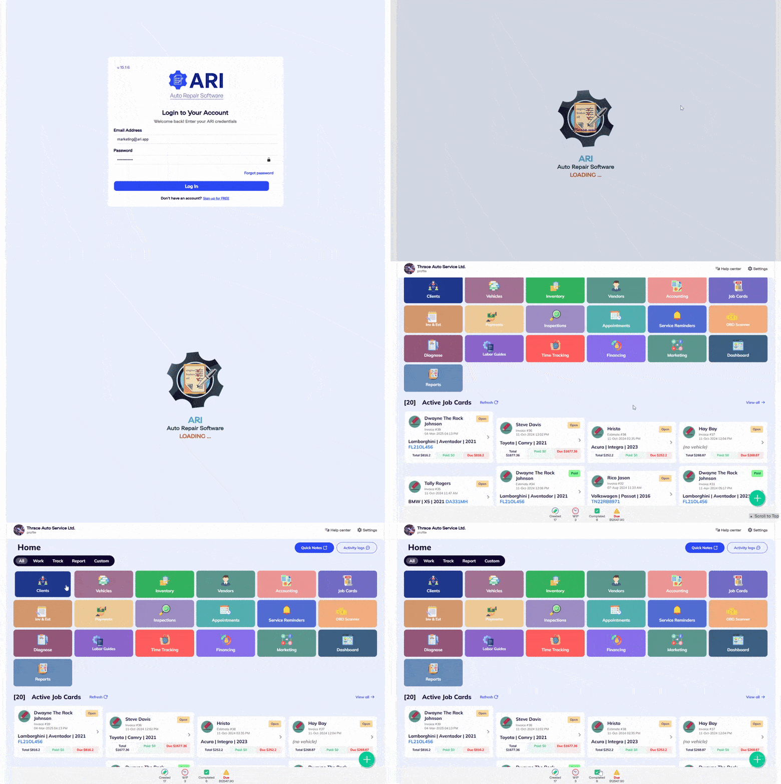
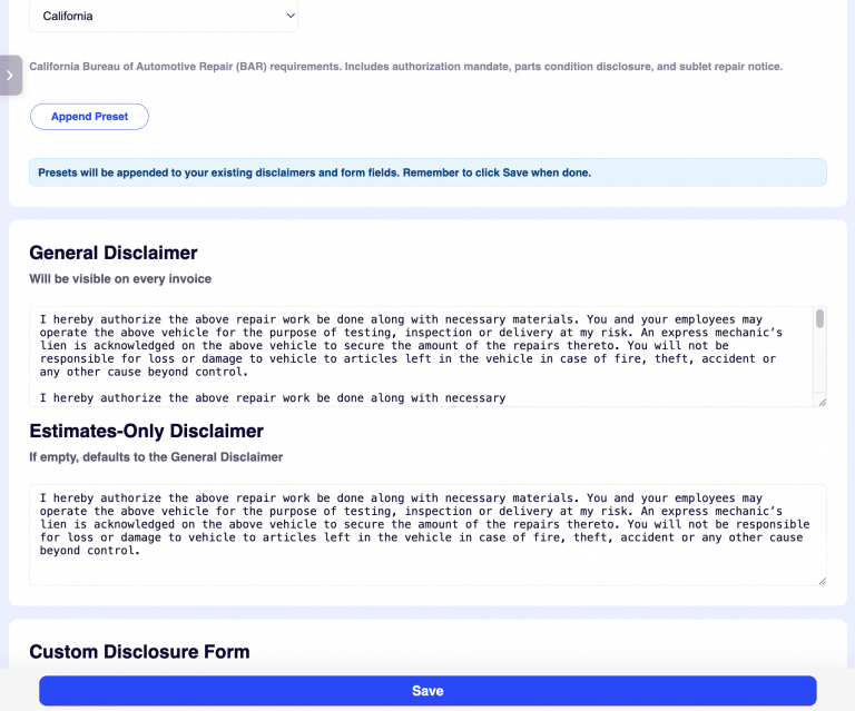
First things first, let’s talk about the look and feel. Every single page in ARI, from where you enter company details to how you manage your inventory and vendors, has been completely overhauled. We wanted everything to have a consistent look, like all your tools are neatly organized. No more jumping from one screen that looks outdated to another that’s more modern. Now, whether you’re creating an invoice, managing client information, or checking stock, everything has a unified design and a much-improved layout. This also means our software is now much more responsive, fitting perfectly whether you’re on a desktop monitor, a tablet, or even your phone.
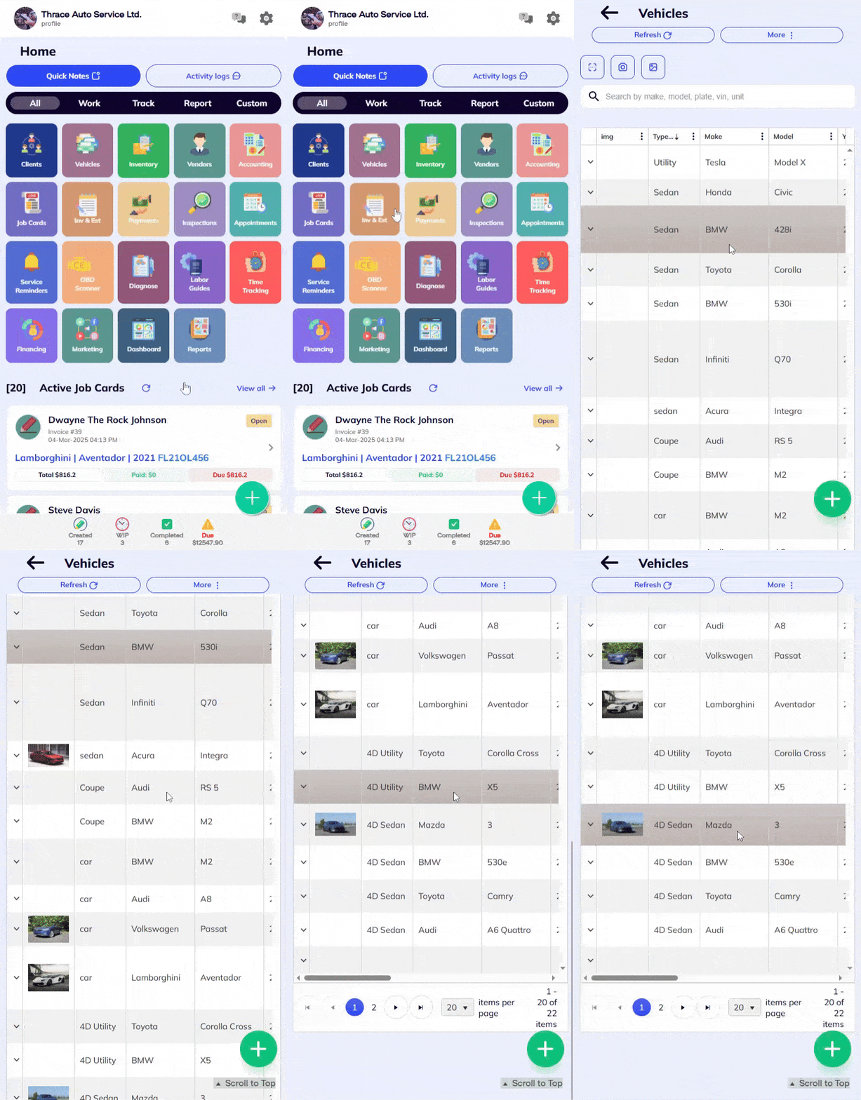
Under the hood, we’ve also been doing some serious work to fix up those nagging web display issues. Ever had trouble scrolling smoothly, or seen things jump around on the screen? We heard you loud and clear. We’ve fine-tuned the native scrolling, adjusted grid layouts so your information lines up just right, and fixed those annoying tab-related problems. The result? A much clearer, more stable view of your data, making it easier on the eyes and less likely to cause frustration.
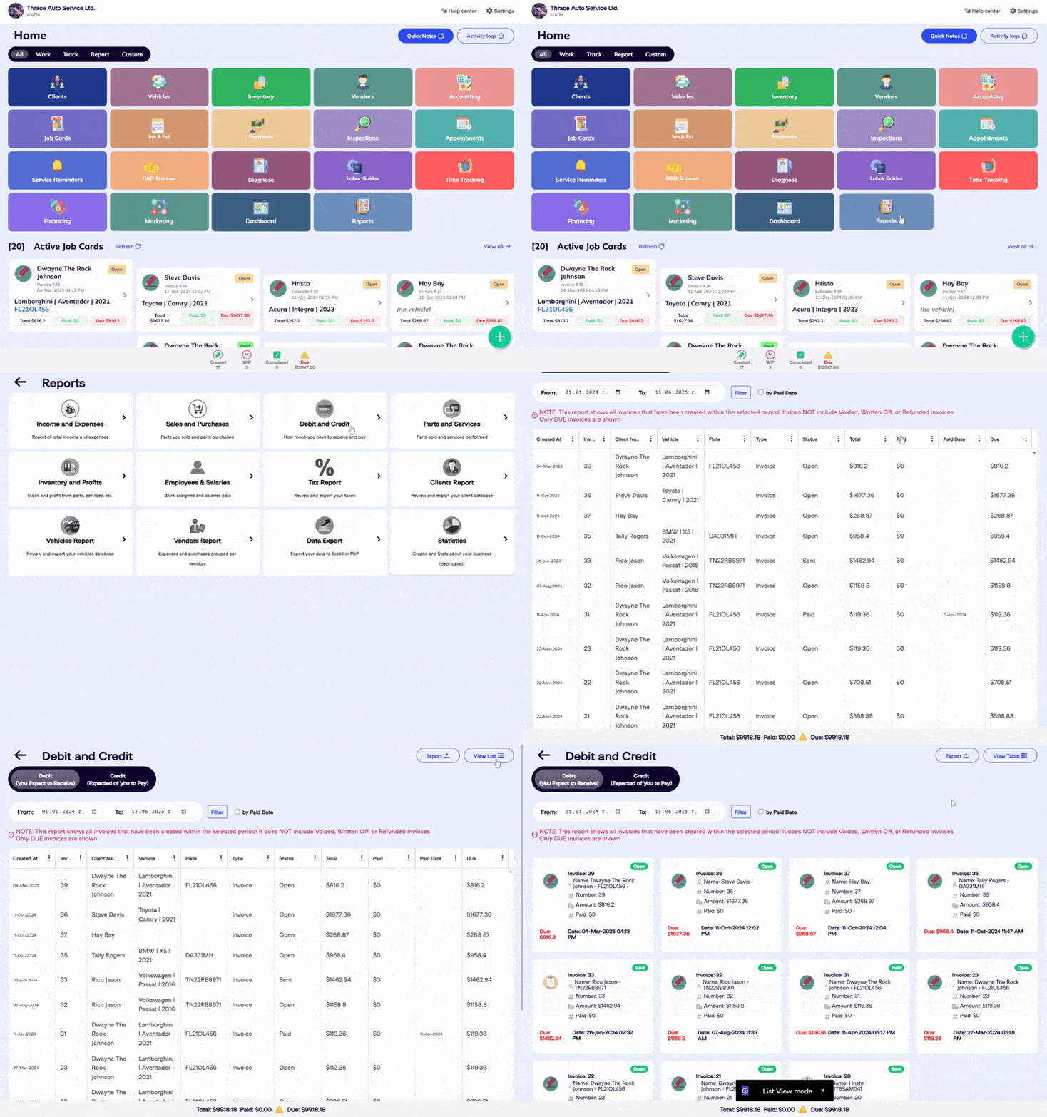
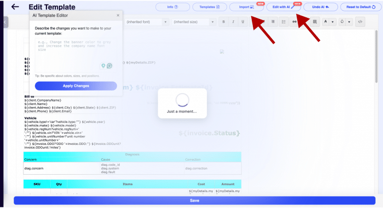
You might also notice the small details, and sometimes these make the biggest difference. We went through every single button, piece of text, and placeholder in the software and gave them a refresh. This wasn’t just about making them look nice; it was about making them clear and consistent. No more guessing what a button does or squinting to read tiny text. Everything is designed to be instantly understandable, saving you precious seconds throughout your day.
And speaking of saving time, we’ve made significant improvements to how you navigate through the software. We’ve added smarter back buttons, improved our pagers so you can flip through lists of clients or parts more efficiently, and supercharged our search functionality. Finding what you need quickly is crucial, and these enhancements are designed to help you get there quickly. It’s like having a well-organized workspace where everything is exactly where you expect it to be.
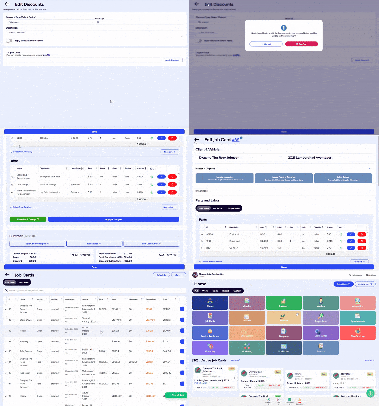
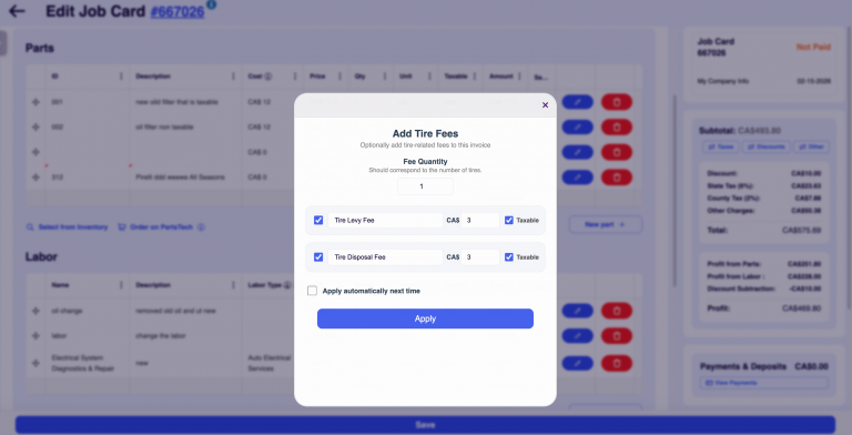
Finally, we’ve added some helpful guidance to assist you along the way. You’ll now see clearer warnings before you do something irreversible, helpful confirmations to make sure you’re on the right track, and more useful explanations to walk you through certain processes. We also gave our modals (those pop-up windows), standard popups, and snackbars (those little notifications that appear at the bottom of the screen) a complete overhaul. They’re now designed to be less intrusive and more informative, ensuring your interactions with the software are as smooth and user-friendly as possible.
We’re proud of this update and believe it’s a game-changer for how you interact with ARI. We’ve put in the effort to make your daily tasks simpler, quicker, and more enjoyable, whether you’re an auto repair shop owner or a dedicated mechanic. We’re always striving to build the best tools for your business, and this redesign is a big step in that direction. Give it a try and let us know what you think!
