Meet ARI, a comprehensive auto repair software for auto repair shops, mobile mechanics, independent technicians, and auto dealers.
Trusted and used by thousands of shop owners, mechanics and workers worldwide.
Meet ARI, a comprehensive auto repair software, trusted and used by thousands of shop owners & mechanics worldwide.
4.7 out of 5 stars based on 1500+ client reviews



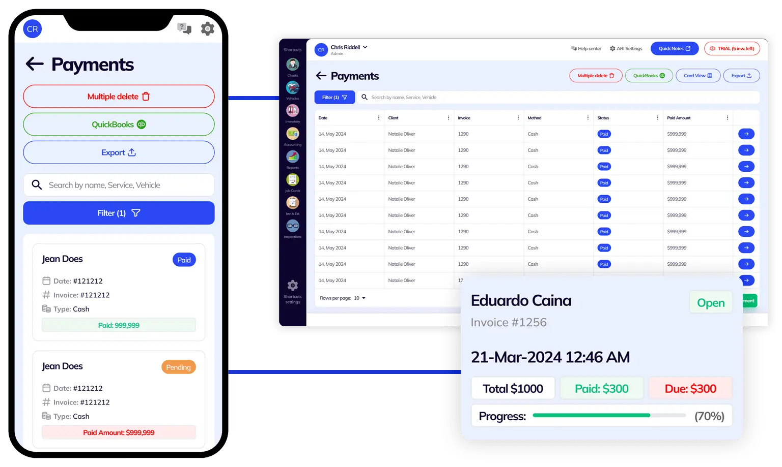
Avoid missing unpaid repair invoices and eliminate payment delays by tracking all your expenses and purchases in one auto shop management software. Offer your clients the possibility to pay their invoices online and send automatic email notifications when a client’s auto repair service is due.
In addition to payment tracking, you can also check important statistics for your auto repair shop straight from your computer and laptop. The ARI team has worked hard to create a standalone program that works on Windows operating systems.

ARI is a full-featured auto repair software that comes with support for multiple users. This means that you can add various shop employees such as mechanics, electricians, accountants, managers, shop owners, and many other roles to ARI and set up specific access to each of them.
Another great benefit that makes ARI one of the best auto repair software in the automobile industry is the fact that it’s built in the cloud. This means that your data is always secure and you don’t have to worry that you could lose your client database if your PC breaks down.
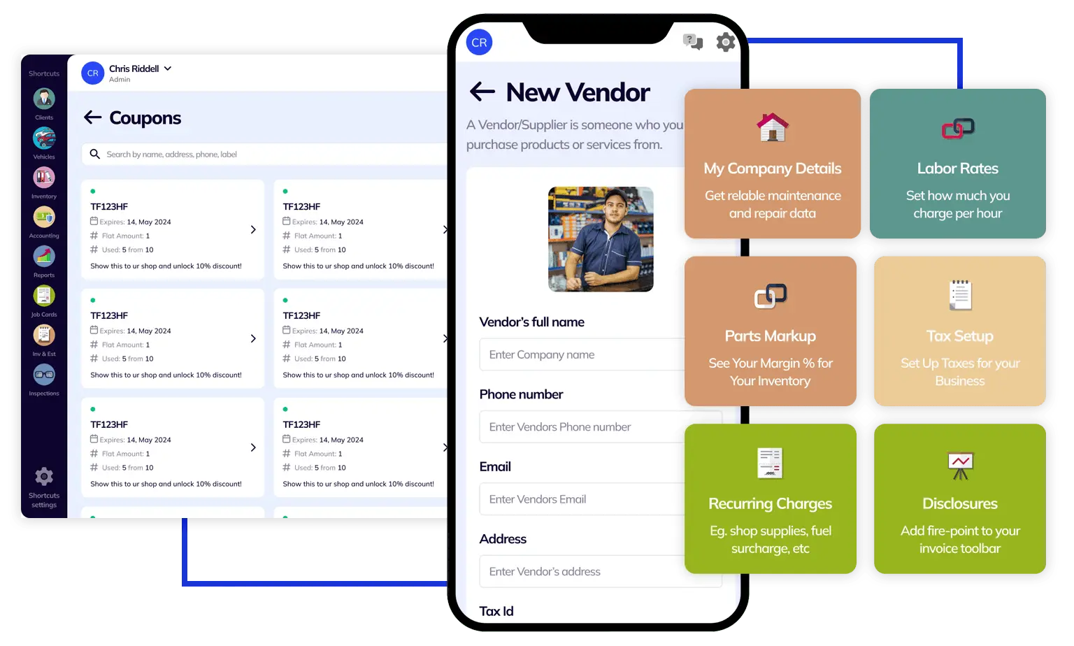
Never miss a payment and never forget about an auto repair appointment. With ARI for mobile, you get the best of the most reliable auto repair software right at your fingertips. Our mobile apps are available for both iOS and Android and come with a lot of features specific to mobile devices. Among the most important features, we wanna mention the OBD scanner, VIN decoder, license plate reader, CarFax service history, and many more.
The mobile ARI app also allows you to offer on-site auto repair services to your clients. You can invoice them on the road and you can even receive payments online. We have integration with Stripe and QuickBooks so you can keep good track of
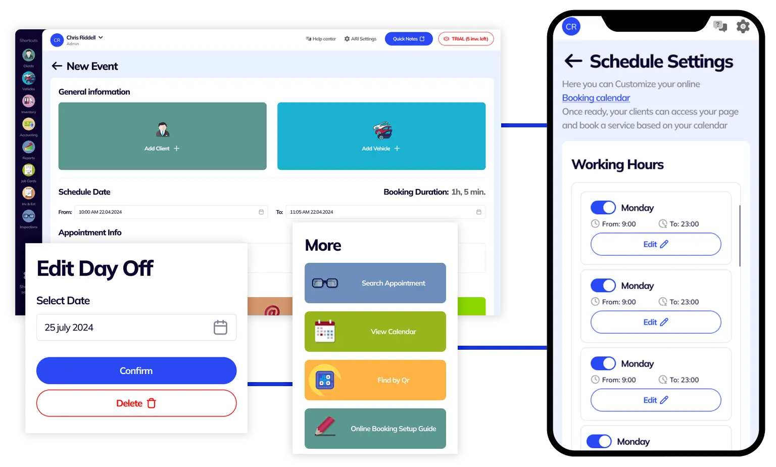
One of ARI’s most used features is the Online Booking integration. You can add functionality for your clients to book your car repair services online right from your website. All you have to do is set up your working hours and list your services in the app.
If you don’t have your website yet, then you can simply send a link to your clients to our own self-hosted auto repair shop directory. Once you create a free account, you will receive your unique link that will direct your clients straight to an appointment form. All your appointments will show up right inside the ARI – auto repair software.
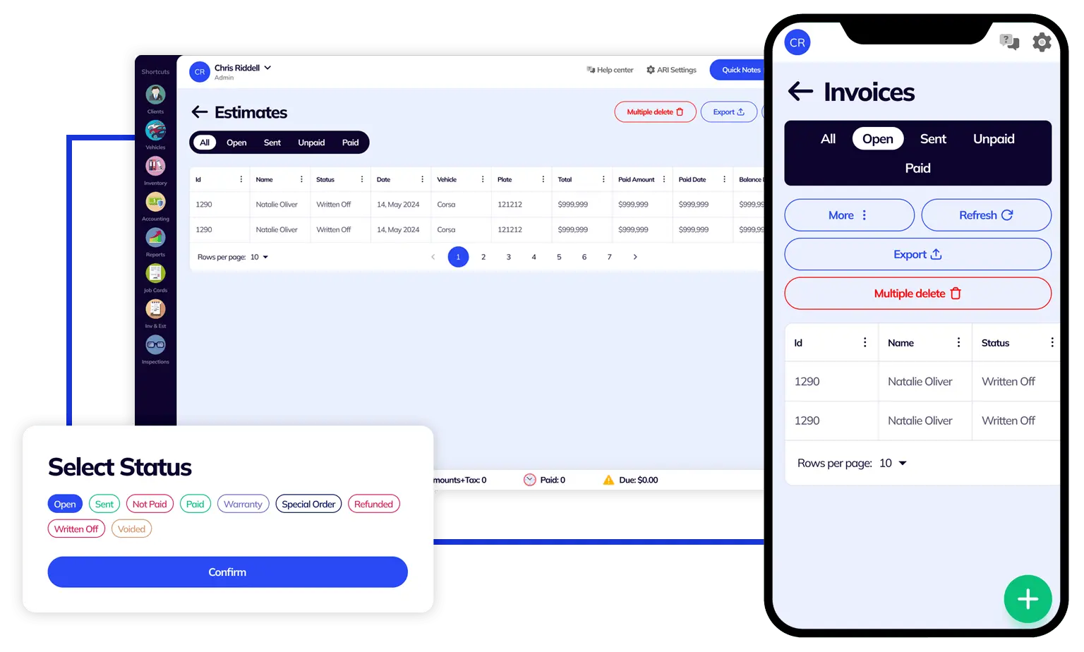
Are you looking for auto repair software that gives you full control over what your estimates look like? Do you want to add custom disclaimers, multiple taxes, and wet signatures on your invoices? With ARI you can do all that and a lot more. Choose from 7 professional car repair invoice templates or customize your auto repair invoice template.
ARI comes with many features that are all meant to provide the best auto repair experience. However, getting started could be a bit overwhelming, especially if you’ve never used automotive repair software before. That is why we have put together a quick guide to help you get started
Transfer your data, set up your profile, and start running your business like a pro in minutes. We have an in-depth guide with all the essential steps to get your auto repair productivity rolling quickly. In the tutorial, you will learn how to set up your profile with the basics like labor rates, parts markup, taxes, employees, user roles, and others.
Then you’ll learn how to add clients and vehicles from a database and start issuing invoices, estimates, and work orders. Once you complete the initial setup – you can start using the other advanced features and bring your efficiency to the next level.

Avoid missing unpaid repair invoices and eliminate payment delays by tracking all your expenses and purchases in one auto shop management software. Offer your clients the possibility to pay their invoices online and send automatic email notifications when a client’s auto repair service is due.
In addition to payment tracking, you can also check important statistics for your auto repair shop straight from your computer and laptop. The ARI team has worked hard to create a standalone program that works on Windows operating systems.

ARI is a full-featured auto repair software that comes with support for multiple users. This means that you can add various shop employees such as mechanics, electricians, accountants, managers, shop owners, and many other roles to ARI and set up specific access to each of them.
Another great benefit that makes ARI one of the best auto repair software in the automobile industry is the fact that it’s built in the cloud. This means that your data is always secure and you don’t have to worry that you could lose your client database if your PC breaks down.

Never miss a payment and never forget about an auto repair appointment. With ARI for mobile, you get the best of the most reliable auto repair software right at your fingertips. Our mobile apps are available for both iOS and Android and come with a lot of features specific to mobile devices. Among the most important features, we wanna mention the OBD scanner, VIN decoder, license plate reader, CarFax service history, and many more.
The mobile ARI app also allows you to offer on-site auto repair services to your clients. You can invoice them on the road and you can even receive payments online. We have integration with Stripe and QuickBooks so you can keep good track of

One of ARI’s most used features is the Online Booking integration. You can add functionality for your clients to book your car repair services online right from your website. All you have to do is set up your working hours and list your services in the app.
If you don’t have your website yet, then you can simply send a link to your clients to our own self-hosted auto repair shop directory. Once you create a free account, you will receive your unique link that will direct your clients straight to an appointment form. All your appointments will show up right inside the ARI – auto repair software.

Are you looking for auto repair software that gives you full control over what your estimates look like? Do you want to add custom disclaimers, multiple taxes, and wet signatures on your invoices? With ARI you can do all that and a lot more. Choose from 7 professional car repair invoice templates or customize your auto repair invoice template.
ARI comes with many features that are all meant to provide the best auto repair experience. However, getting started could be a bit overwhelming, especially if you’ve never used automotive repair software before. That is why we have put together a quick guide to help you get started
Transfer your data, set up your profile, and start running your business like a pro in minutes. We have an in-depth guide with all the essential steps to get your auto repair productivity rolling quickly. In the tutorial, you will learn how to set up your profile with the basics like labor rates, parts markup, taxes, employees, user roles, and others.
Then you’ll learn how to add clients and vehicles from a database and start issuing invoices, estimates, and work orders. Once you complete the initial setup – you can start using the other advanced features and bring your efficiency to the next level.
Send unlimited invoices and estimates to clients with ease.
Add clients, vehicles & all the details that are relevant to them.
Create detailed inspections with checklists, damage reports, pictures, AI, or written annotations.
Your entire accounting and expense tracking from a single place.
Use it to engage with your clients and show their business with you.
Manage your parts, tires, business assets, and all other important items.
Get detailed reports for your business performance and export the data when necessary.
Track card, cash, check, online, and other payments effortlessly.



With ARI, you get tailor-made technical and utility features based on years of user feedback and development.

Issue Invoices and Work orders for the maintenance and diagnostics of your motorcycle repair business.

Deliver exceptional truck maintenance and grow your business successfully with our truck repair software.

The perfect affordable, quality heavy-duty repair shop software for dealing with heavy machinery, trucks, buses, or other construction equipment.

Auto body repair shop software with advanced vehicle inspection & diagnostics options. Optimized for speed & quality data delivery.

Maintain and repair your fleet of boats and sea vessels with our marine repair software.

A reliable auto dealership software that simplifies your workflow and business management and boosts your client engagement.

Choose ARI for its online appointment options, Inventory, and vehicle management features for your auto detail service.

Simple and modern auto glass repair tools for your daily needs.

Use the client portal and notes tab for a hassle-free recording of daily customer requests.

List your bike repair services and send invoices on the go with our software.

Send online estimates and collect online payments when you are doing mobile services.

With ARI, you get tailor-made technical and utility features based on years of user feedback and development.

Issue Invoices and Work orders for the maintenance and diagnostics of your motorcycle repair business.

Deliver exceptional truck maintenance and grow your business successfully with our truck repair software.

The perfect affordable, quality heavy-duty repair shop software for dealing with heavy machinery, trucks, buses, or other construction equipment.

Auto body repair shop software with advanced vehicle inspection & diagnostics options. Optimized for speed & quality data delivery.

Maintain and repair your fleet of boats and sea vessels with our marine repair software.

A reliable auto dealership software that simplifies your workflow and business management and boosts your client engagement.

Choose ARI for its online appointment options, Inventory, and vehicle management features for your auto detail service.

Simple and modern auto glass repair tools for your daily needs.

Use the client portal and notes tab for a hassle-free recording of daily customer requests.

List your bike repair services and send invoices on the go with our software.

Send online estimates and collect online payments when you are doing mobile services.
24/7 Customer Support
Contact us via email at contact@ari.app, and we will reply promptly.
ARI Video Guides
ARI's official video library with all of the guides you need
ARI (Auto Repair Software) © 2024 | by uMob.ltd
The Capterra logo is a service mark of Gartner, Inc. and/or its affiliates and is used herein with permission. All rights reserved.
Add clients, vehicles & all the details that are relevant to them
Create detailed inspections with checklists, damage reports
Manage your parts, tires, business assets, and all other important items.
Track labor progress, start & stop work clocks, approve & deny services.
Create professional quotes for your auto repair clients
Generate professional invoices for your auto shop’s clients
Generate damage reports & attach pictures to your auto inspections
Let your clients book your services online from the comfort of their home
Earn return customers by reminding them when service is due
Create purchase orders, track your expenses, and monitor your profits
Read Engine Error Codes with ARI monitor car’s parameters live
Reports for your business performance & export the data
Never miss a payment keep an eye on your invoice billing process
Reach your core customers & market business across different channels
Manage vendors, partners & orders for a streamlined repair experience
Monitor and label the activity of multiple employees
Receive payments on your Online Invoices with the world’s most renowned payment networks
Order parts easily with PartsTech and ARI! Smooth and reliable parts procurement process.
Every mechanic benefits from quality Repair Guides and Car Repair Estimates.
Get Service History Instantly. Decode VINs and Plates with Accurate Data from a Leading Supplier.
Get Diagnostic & Maintenance Info. Access Diagnosis, Solutions, and Problem Predictions.
Sync ARI invoices to QuickBooks Online. Manage customers and inventory.
Process In-Person Payments On The Spot. Geared towards auto repair businesses.
ARI has partnered with Wisetack to offer your clients extra payment options for auto repair services.
You can access ARI on all major digital platforms.
A complete guide to setting up and running your auto repair business
ARI offers features and settings tailored for auto repair services
Test the features and see if it’s the right fit for you
You must ensure you keep your app updated all the time
Here are our most notable achievements over the years.
Welcome to ARI's blog for updates, articles, and guides
Welcome To ARI's Official Video Library
Earn rewards and ARI credits by referring our app to friends
ARI’s client portal lets clients easily stay informed when they visit you
How to add multiple users to your ARI Profile